
Top 10 Fonts That Revolutionized Design and Branding

Fonts shape the way we see brands, and the right typeface can define an entire era of design.
#1: Helvetica (1957)
 A go-to for brands like BMW, American Airlines, and the NYC Subway, Helvetica’s clean, modern design makes it one of the most influential typefaces ever. (Source: Helvetica, A Documentary Film.)
#2: Times New Roman (1931)
 Originally designed for The Times newspaper, this font became the standard for print and digital documents worldwide. (Source: Monotype Imaging)
#3: Garamond (16th Century, Revived 1920s)
 Used by brands like Apple in early marketing, this elegant serif font is synonymous with sophistication and readability. (Source: Adobe Type Library)
#4: Futura (1927)
 A geometric sans-serif beloved by Volkswagen, Supreme, and NASA, Futura’s sleek, modern look has influenced countless brand identities. (Source: Bauer Type Foundry)
#5: Bodoni (1798, Revived 20th Century)
 This high-contrast serif font has been a staple in luxury branding, including Vogue magazine and upscale fashion houses. (Source: Linotype Library)
#6: Gotham (2000)
 Made famous by Barack Obama’s 2008 presidential campaign, Gotham became a modern branding powerhouse used by many corporate identities. (Source: Hoefler & Co.)
#7: Impact (1965)
 Designed for maximum boldness, Impact is widely recognized for its use in memes and strong visual branding. (Source: Monotype Corporation)
#8: Comic Sans (1994)
 Love it or hate it, Comic Sans was revolutionary in making typography feel friendly and informal, influencing digital communication. (Source: Microsoft Typography)
#9: Didot (1799, Modern Use in Luxury Branding)
 A favorite of fashion brands like Giorgio Armani and Harper’s Bazaar, Didot exudes high-end elegance. (Source: Linotype Library)
#10: Roboto (2011)
 Google’s signature typeface for Android and Material Design, Roboto modernized digital typography with its clean and flexible appearance. (Source: Google Fonts)
Where Typography Meets the Built Environment
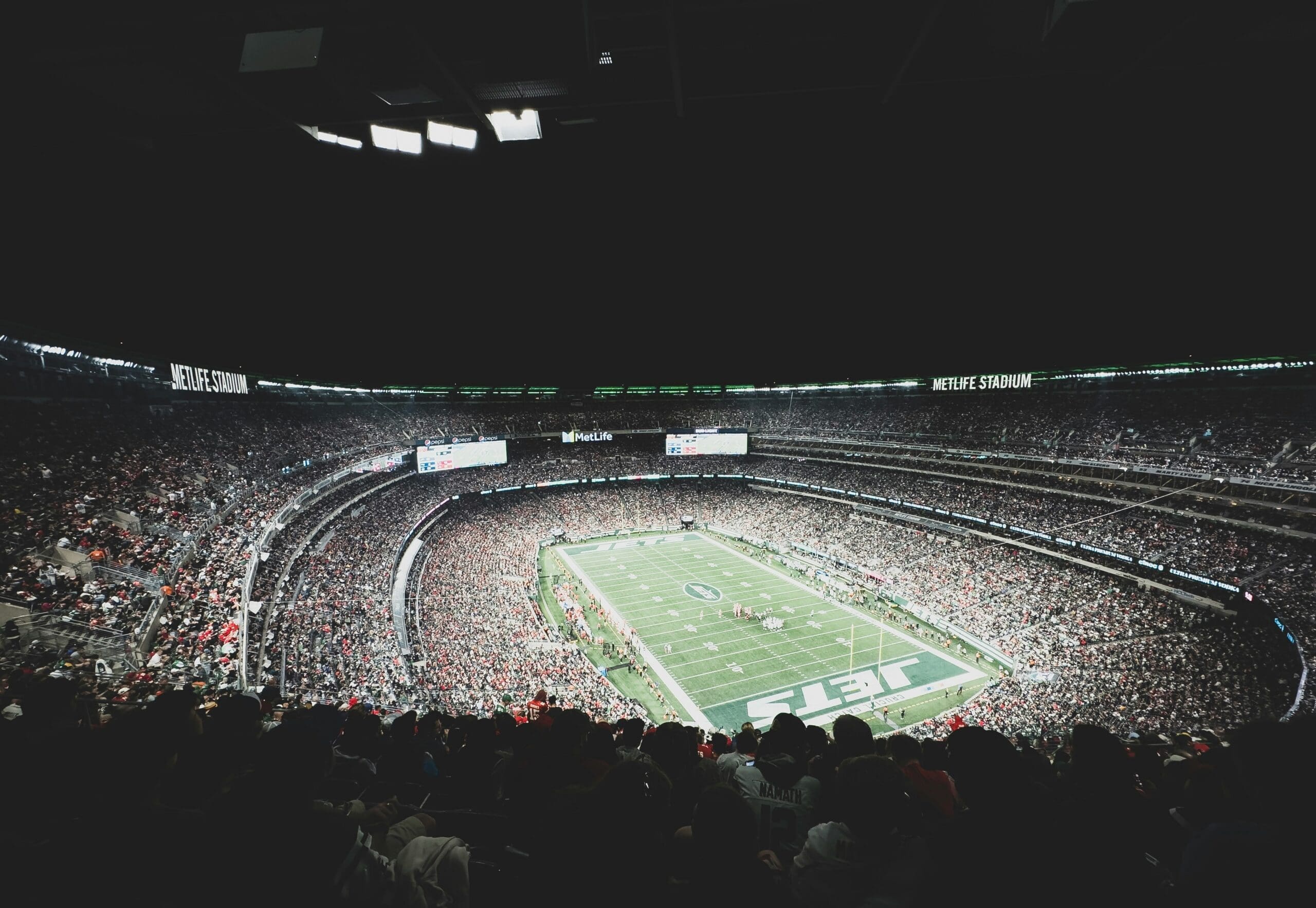
Choosing the right typeface is only part of the equation. Once typography moves into a physical environment, scale, viewing distance, materials, lighting, and the surrounding architecture all affect how well it performs. What works on a screen or in a brand guide also needs to work across a stadium concourse, building entrance, dimensional sign, or large-scale graphic.
That's where design and execution come together. At Pinpoint, we work with architects, designers, agencies, brands, and venue operators to translate established brand identities into physical spaces. From wayfinding signage that helps people navigate complex environments, environmental branding that brings a brand into the space around it, to large-format signage, graphics and displays produced for visibility and impact at scale, typography becomes an important part of how the entire environment looks, feels, and functions.
The typeface may already be defined. Our job is to understand the design intent and determine how to bring it to life, at the right scale, with the right materials and fabrication approach, for the environment where it ultimately needs to perform.
Learn More About Pinpoint
See What We Do