Aspen Discovery:
Brand Guidelines and Logo Creation
ByWater Solutions, a library software support and implementation company, acquired a new, open-source software, called “Aspen Discovery” (named after the aspen tree).
They needed brand visuals for marketing and icons for the software’s installation. Having worked with Pinpoint to produce marketing materials in the past, they asked us to ideate and create a new brand.

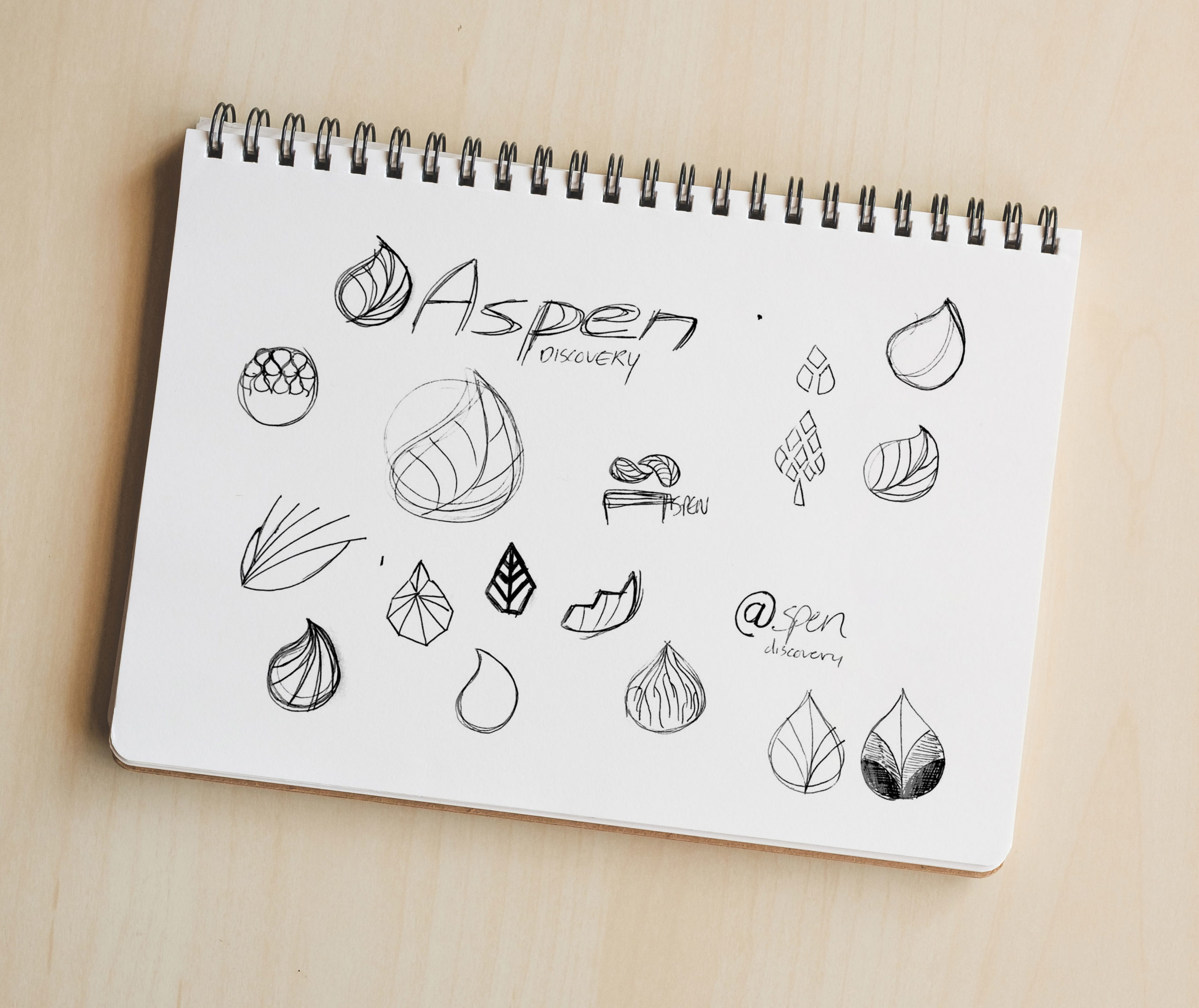
The logo itself features a design inspired by both a tree and the aspen leaf, in which the branches or veins all visually flow back to a single point—a metaphor for Aspen’s main purpose and core feature: the backend organizing of multiple media under a single query of any library computer.
Looking at the veins in reverse, the leaf or tree grows from a single point outward, which evokes the library patron’s journey of growth, connection, knowledge, and discovery.


Deliverables
- Complete visual identity
- Pantone® colors for the brand along with a psychological profile for each color and what they’re meant to convey to patrons and clients
- In-depth typography explanation
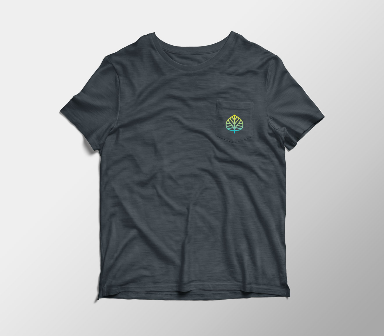
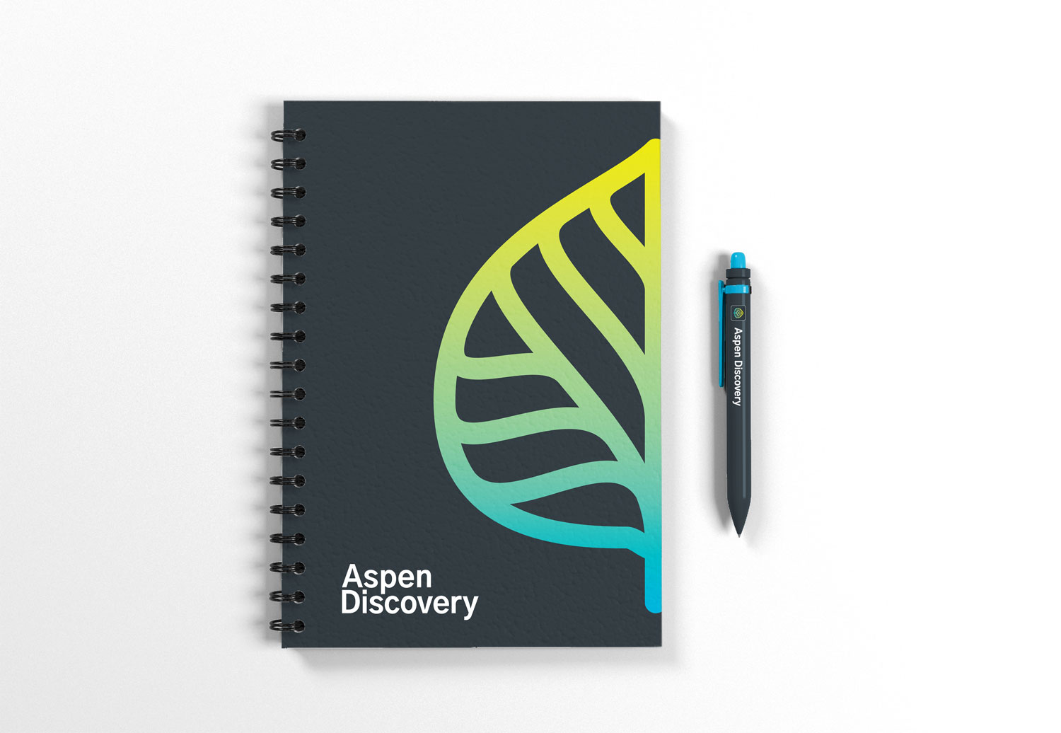
- Alternate logo configurations, color versions, and sizing guidelines
- Example uses of the logo to inspire the imagination